top of page

Overview:
The objective of this project was to integrate messaging features in an already-existing fitness app in order to create sustained engagement. Taking it a step further, I decided to combine features of social media, including messaging, with a fitness app to create a product that users would want to continue using.
Role:
Product Designer
Key Skills:
Competitive Analysis, User Interviews, User Flows, Prototyping, Usability Testing
Timeline:
August 2023 - September 2023
Background
Before embarking on this project, I needed to first understand what I was working with. The company that launched this fitness app was noticing user engagement drop after the first three weeks of downloading the app. As such, the business goal was to design new messaging features that would 1) Create the opportunity for users to message each other with health and fitness goals/achievements and 2) Create an integrated messaging experience throughout the product that drives engagement and repeat usage.
Research
To begin my project, I first studied current industry leaders. As a user, I downloaded and went through each app - Productive Habit Tracker, Map My Run, Nike Run Club, and Fitlist - and made note of which features stood out and which I thought could be improved.


After evaluating the features of each app, I then conducted five user interviews. Through my user interviews, I aimed to answer the following questions:
What causes user engagement in apps to decline?
1
Why might users not meet their fitness goals?
2
How can social engagement help users meet fitness goals?
3
A glimpse at my virtual user interviews

Using the insights I gathered from the user interviews, I determined I wanted to combine a social media app with a fitness app to give users a product that was motivating, easy-to-use, and interactive.
My research notes and insights
Flow 1: Sharing Event with Friend
Homepage
Search event
Search
results
Select event
Share
Flow 2: Interacting on Friends Feed
Homepage
Feed
Like/Comment
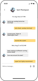
Flow 3: Direct Messaging
Homepage
DMs
Send Message
Flow 4: Chat on Event Page
Homepage
Events
Select Event
Send Message
Ideate
Before getting started with prototyping, I first came up with the user flows that I wanted to prioritize in the design.
Design & Validate
With my user flows in mind, I proceeded to translate my user flows into a low-fidelity prototype that I could use for testing.
A few examples of my low-fidelity screens:
chat with others going
to the same event
.png)
.png)
.png)
.png)
send events to your friends
interact with your friends'
posts/accomplishments
After completing my low-fidelity prototype, I conducted five remote usability test sessions in order to gauge my product’s usability. Some key takeaways that I wanted to implement when creating my high-fidelity prototype were:
-
Distinguish what each tab in the navigation bar leads to
-
Ensure consistency among features within the app (i.e. goals, challenges, groups)
-
Add titles to pages to improve user experience
A few examples of my high-fidelity screens:
.png)
.png)
.png)
direct message your friends
After finishing my high-fidelity prototype, I conducted one last round of usability testing. The aspect that confused the most users was the “Move” tab, so I knew I wanted to rename and reorganize the tabs once more to make the intention of each tab as clear as possible.
Some other smaller edits I made included:
-
Keeping the logo and notification bell sticky at the top of the feed page
-
Adding more touches of my primary color
.png)
.png)
Hi-Fi Prototype
Final Design
.png)
.png)
Hi-Fi Prototype
Final Design
Takeaways
1. It’s important for users to be able to understand how to use the product.
Through my rounds of testing, something I observed was that users weren’t always sure where to navigate in order to complete a task. With each iteration of Sweat Squad, I had modified the bottom navigation bar in an effort to make my design more intuitive and easy to navigate. The feedback that I had gotten from the testing sessions showed the importance of having a product that is both understandable and usable.
2. Don’t lose sight of the end goal of the product.
Throughout the process of designing Sweat Squad from research up to the final prototype, I realized it was easy to get carried away and lose sight of the end goal that I was designing for. I found myself putting more focus on the social media aspect with my first prototype and less focus on the fitness aspect. As Sweat Squad is supposed to be a fitness app at its core, I had to get myself back on track with subsequent iterations to ensure the product was a fitness app with a social component rather than a social media app with a fitness component.
3. Keep what works and discard what doesn’t.
By studying industry leaders prior to starting the design of Sweat Squad, I was able to build a foundation of features of fitness apps that I thought worked well. Additionally, throughout my rounds of testing, the feedback I got from users helped me narrow down what aspects of my product were appropriate as well as what aspects of my product may have been confusing or unnecessary. As such, with each iteration of my product, I was able to end up with the best product possible.
bottom of page